
For our third challenge of the 2022-2023 program year, we partnered with E. Warren Development Corp (EWDC), a nonprofit with a mission to support and enhance the E. Warren commercial corridor and adjacent neighborhoods through collaboration, community engagement, and equitable development. Five teams of Fellows worked alongside the EWDC staff and neighborhood stakeholders to create deliverables for this project – learn more from the perspective of each team!
“What you see is what you get at E. Warren,” says E. Warren resident Sydney LaDuke. With this project, we focused on creating deliverables that represent who EWDC is and invoke the spirit of their community.
Throughout this project we learned so many amazing things that E. Warren Development Corp does to support their community. The business and community development within the corridor they do has not been getting as much attention as one would expect. “The proof is in the pudding” and it is time to show the recipe. Our objective as a team was to develop a marketing strategy that would highlight all of the wonderful work happening because of EWDC and the community.
One of the core moments we had was rebranding EWDC. One of our liaisons Brittni “Bee” Brown, encouraged us to put together a presentation with new fonts and colors within 15 minutes. Using color theory and input from Sarah, we were able to put together a new palette that represents EWDC’s presence in the community. Seeing this rebranding already being put to use across the project teams and on social media has brought us immense joy. This project has been one of the most gratifying yet.
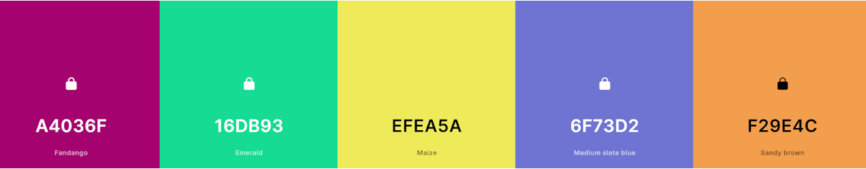
In the spirit of this pivotal moment, we decided to use color theory to brand our team! The above colors were chosen to represent each individual team member.
Eva – Fandango: the color reminds us of berries, showing how she is sweet and bubbly. The undertones of red represent her strength. The color is fun and represents her laid back and creative spirit.
Daniel – Emerald: this color is fresh and exemplifies Daniel’s fresh ideas and growth mindset. Like the name, Daniel is a gem. Earthy colors are usually humbling, which Daniel is. However, the brightness of this color shows Daniel’s fun spirit as he cracks jokes and engages those around him.
Kyra – Maize: yellow represents Kyra’s contagious vibrancy. She makes you feel like you are home and radiates confidence that is then instilled in you. Kyra’s spirit lightens the whole room, bringing joy and warmth wherever she goes. She is sunshine personified, just like this color.
Katie – Medium Slate Blue: represents Katie’s strength and leadership throughout this project. It’s calming and reassuring properties illustrate Katie’s ability to support us and put our best foot forward, leading and caring with compassion. Katie is truly a comfort to have on the team and shined in her opportunity at being team lead.
Katherine – Sandy Brown: orange represents her boldness and creativity. This shade can be built upon and allows others to shine. Katherine does just this. Constantly the foundation of our team, she builds those around her up and lets them glow, while still being vibrant herself.
Together, we make a vibrant team. We are proud of all that we have created for our partner and can’t wait to see the future of EWDC.
Blog by Fellow Team: Katie Ferriby, Katherine Kenney, Eva Morlock, Kyra O’Guinn, Daniel Arini
***